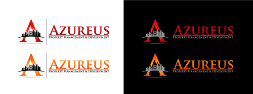
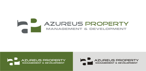
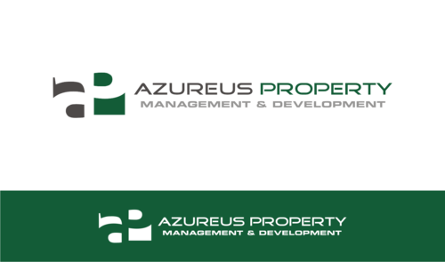
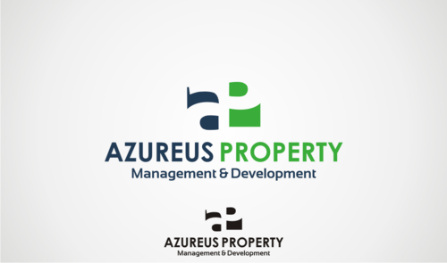
LOGO & STATIONARY DESIGN FOR PROPERTY MANAGEMENT & DEVELOPMENT COMPANY
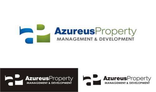
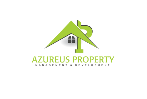
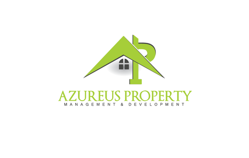
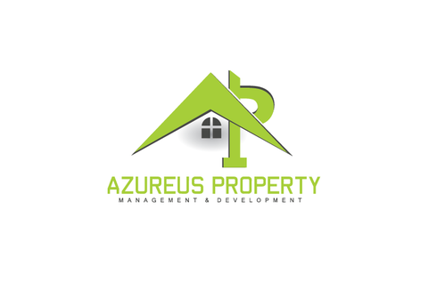
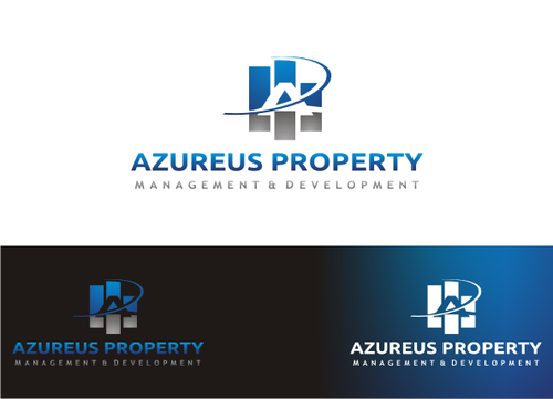
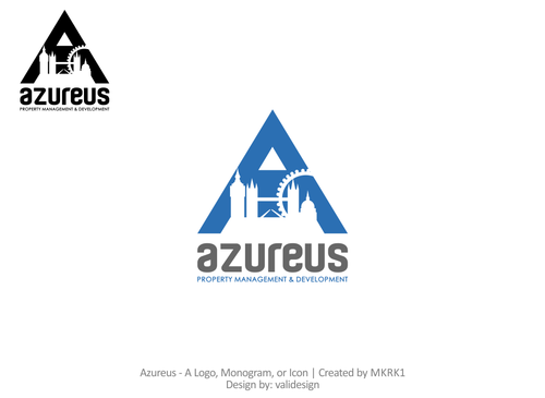
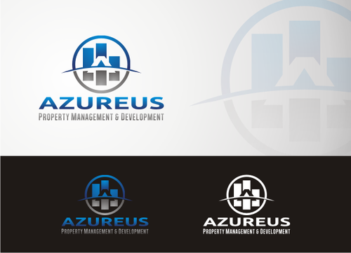
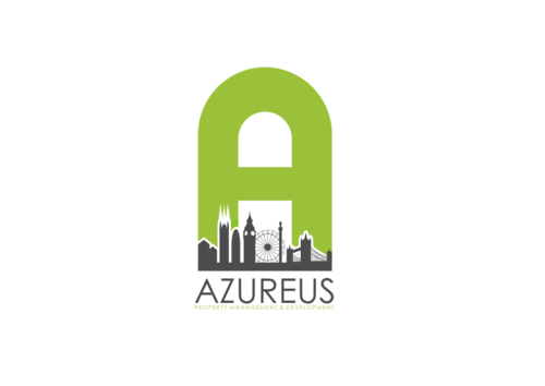
Azureus Property Management & Development
|
Contest Holder
MKRK1
?
Last Logged in : 4174days12hrs ago |
Concepts Submitted
150 |
Guaranteed Prize
199 |
Winner(s) | A Logo, Monogram, or Icon |
|
Live Project
Deciding
Project Finalized


Creative Brief
LOGO & STATIONARY DESIGN FOR PROPERTY MANAGEMENT & DEVELOPMENT COMPANY
Azureus Property Management & Development
No
The design must have a modern and contemporary look, but maintaining a professional look.
The clientele will be of all ages, therefore the modern and contemporary look is important but to show that we are professional is a must as the business will be dealing with management and development of properties..
When people see the logo they must think that it stands out but is also smart and its look will reflect on how well/imaginative the company is in its development sector.
The property will be having a rental/sale department but not as its main business, so having the traditional house/roof type of logo does not interest me too much, but still open to this as long as its creative. I am happy for the logo to be an icon and the text to do the explaining.
Real Estate
Symbolic
![]()
Abstract Mark
![]()
Initials
![]()
Illustrative
![]()
Character
![]()
Web 2.0
![]()
Modern
Cutting-edge
Sophisticated
Simple
Professional
Having had too much thought into this, however 2 colors with good contrast is useful: Light green/White Black/Gold Black/White Blue/White Green/Grey Red/White green/white/blue green/grey/white black/orange/white Open to Ideas as long as not too crazy !
not sure
I have thought about this and have the following ideas that could be used:
1) Using the "A" as a logo and work off this. The "Property Management & Development must be in there somewhere. Ideas include adding the London buildings silhouette in the logo somewhere, such as:
http://www.shutterstock.com/pic.mhtml?id=187211912&pl=39452-43068
A quick search off Google shows what i am open to:
https://www.google.co.uk/search?q=logo+designs+with+Letters&client=firefox-a&hs=KEc&rls=org.mozilla:en-US:official&channel=sb&source=lnms&tbm=isch&sa=X&ei=kOFfVMa3DaW17gaS9IDwBg&ved=0CAgQ_AUoAQ&biw=1366&bih=657
2) I am open for the whole text to be used as the logo (Azureus Property Management & Development) , but getting creative with this would be great. Smart and Sharp is the aim.
Found some further ideas off this site:
http://hative.com/50-cool-letter-e-logo-design-inspiration/
3) The points above are not a must, just my own thought, but im sure there's plenty of better ideas running through your heads!
Related Contests


